Football logos are more than just symbols; they represent a team’s history, culture, and identity. Over the years, American football logos have evolved significantly, reflecting changes in design trends, branding strategies, and team identities. This article explores the fascinating journey of football logos in the USA, highlighting fundamental changes and their significance.
Early Days of American Football Logos
In the early days of American football, team logos were simple. Many teams opted for basic designs, often featuring initials or simple icons. These early logos were primarily used on team uniforms and promotional materials.
For example, the Green Bay Packers, established in 1919, initially used a primary “G” logo. This simplicity was typical of the era, reflecting the straightforward nature of the sport and its emerging fan base.
The 1960s: Birth of Iconic Logos
The 1960s marked a significant shift in football logo design. As the sport gained popularity, teams began to invest in more sophisticated branding. Logos became more detailed and colorful, aiming to capture the essence of the teams they represented.
One notable example is the Dallas Cowboys. Their star logo, introduced in 1964, has become one of the most recognizable symbols in sports. The five-pointed star reflects Texas’ nickname, “The Lone Star State,” and has remained unchanged, highlighting its timeless appeal.
1970s-1980s: Embracing Modern Design
During the 1970s and 1980s, football logos embraced modern design elements. This era saw the introduction of more dynamic and aggressive imagery, reflecting the intense and competitive nature of the sport.
The evolution of the Denver Broncos logo is a prime example. In 1970, the team introduced a bold new logo featuring a charging horse. This logo symbolizes the team’s fierce spirit, and it has undergone several updates, each iteration retaining the core image of the mighty Bronco.
The 1990s: Sleek and Stylized
The 1990s saw a trend towards sleeker, more stylized logos. Teams sought to create more polished, professional images that appealed to a broader audience. The use of computer-aided design tools allowed for more intricate and refined logos.
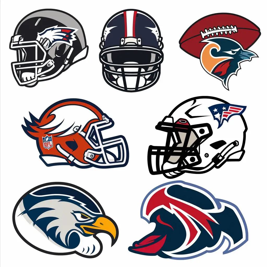
The New England Patriots’ logo transformation in 1993 exemplifies this trend. The team replaced their traditional “Pat Patriot” logo with a more modern and streamlined “Flying Elvis” design. This change modernized the team’s image and aligned with the NFL’s broader marketing strategies.
2000s-Present: Reflecting Tradition and Innovation
In the 2000s, football logos began to balance tradition with innovation. Many teams revisited their classic logos, modernizing them while retaining essential elements that resonate with long-time fans. This approach ensures that the logos honor the teams’ histories while appealing to new generations.
The San Francisco 49ers, for example, updated their iconic “SF” oval logo in 2009. The redesign featured a bolder color palette and a more refined shape, preserving the familiar symbol while giving it a contemporary edge.
Unique Logos and Anniversary Editions
Another interesting aspect of football logo evolution is the introduction of memorable logos and anniversary editions. These unique designs celebrate significant milestones and achievements, adding another layer of storytelling to the team’s brand.
The Pittsburgh Steelers, known for their unique “Steelmark” logo, have released various special editions to commemorate their Super Bowl victories. These memorable logos often incorporate elements from the original design, adding symbols or dates to mark the occasion.
Impact of Logo Evolution on Fan Engagement
The evolution of football logos is not just about aesthetics; it plays a crucial role in fan engagement. Logos are vital to a team’s identity, appearing on merchandise, stadiums, and digital platforms. A well-designed logo can strengthen the connection between a team and its fans, fostering a sense of pride and loyalty.
Teams like the Chicago Bears and the Miami Dolphins have successfully used logo updates to rejuvenate their brands and engage with their fan base. By balancing respect for tradition with contemporary design trends, these teams have maintained solid, recognizable brands that resonate with old and new fans.
Conclusion
The evolution of American football logos reflects broader changes in design trends, marketing strategies, and cultural shifts. From the simple, straightforward designs of the early days to today’s sophisticated, polished logos, each iteration tells a story of the team’s journey and its connection with fans. As football continues to grow and evolve, so will the logos representing its teams, blending tradition with innovation to create symbols that stand the test of time.
FAQs
Teams update their logos to stay current, appeal to younger fans, and strengthen their brand image. Sometimes it’s to mark a new era, a stadium move, or simply to modernize outdated graphics.
The Cincinnati Bengals and the Denver Broncos are good examples of teams that have rebranded multiple times. Each redesign showed a shift in style, from simple, cartoon-like logos to more aggressive and modern looks.
One big trend is the shift from flat, minimal logos in the mid-20th century to sharper, more dynamic designs today. Many modern logos use bold colors, motion effects, and fierce mascots to emphasize power and speed.
